Tasty Room case study
Tasty Room is a distinguished brand specializing in a wide array of international snacks, treats, and soft drinks. With successful operations in multiple physical locations, the brand’s online presence presents a notable challenge, characterized by significant cart abandonment rates and low signup engagement.
Goal
Identify the root causes of this undesirable phenomenon and recommend a robust solution. Establish a coherent user journey to optimize engagement and conversion.
Scope
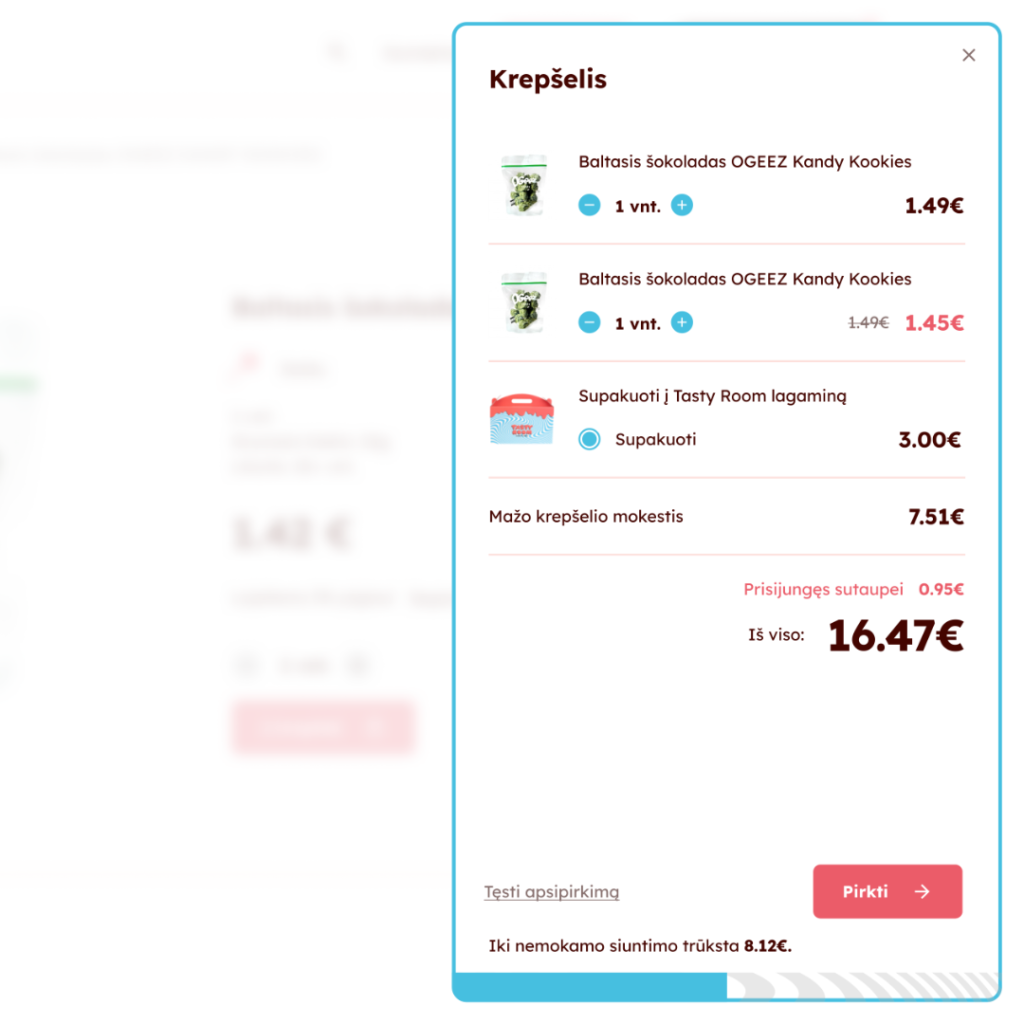
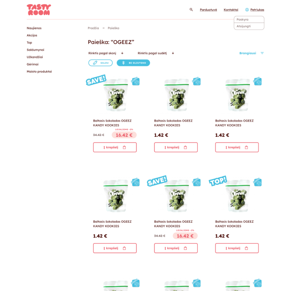
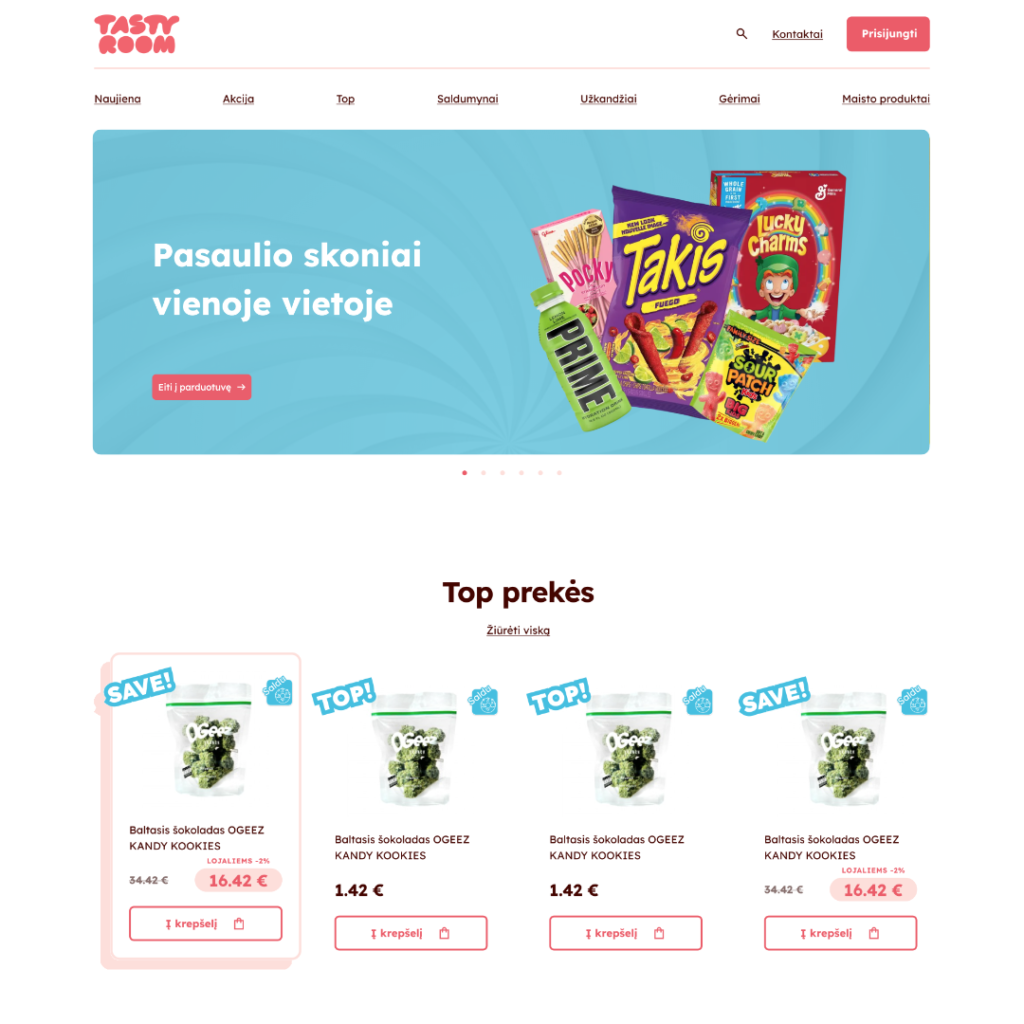
Revise graphic elements and, if required, restructure the website hierarchy. This includes enhancements from the homepage to product pages, as well as refining the purchase flow and user dashboard experience.
Research
The customer-supplied personas served as the foundation for subsequent research endeavors.
Our methodology involved conducting a comprehensive website analysis, revealing significant usability concerns such as non-functioning buttons and intrusive add-to-cart behavior, alongside moderate issues like overly complex registration forms and unclear purchase flows. Furthermore, qualitative experiments conducted with the target demographic, aligned with the user personas, unearthed subtle yet pivotal flaws within the current purchase flow design.
Ideation process
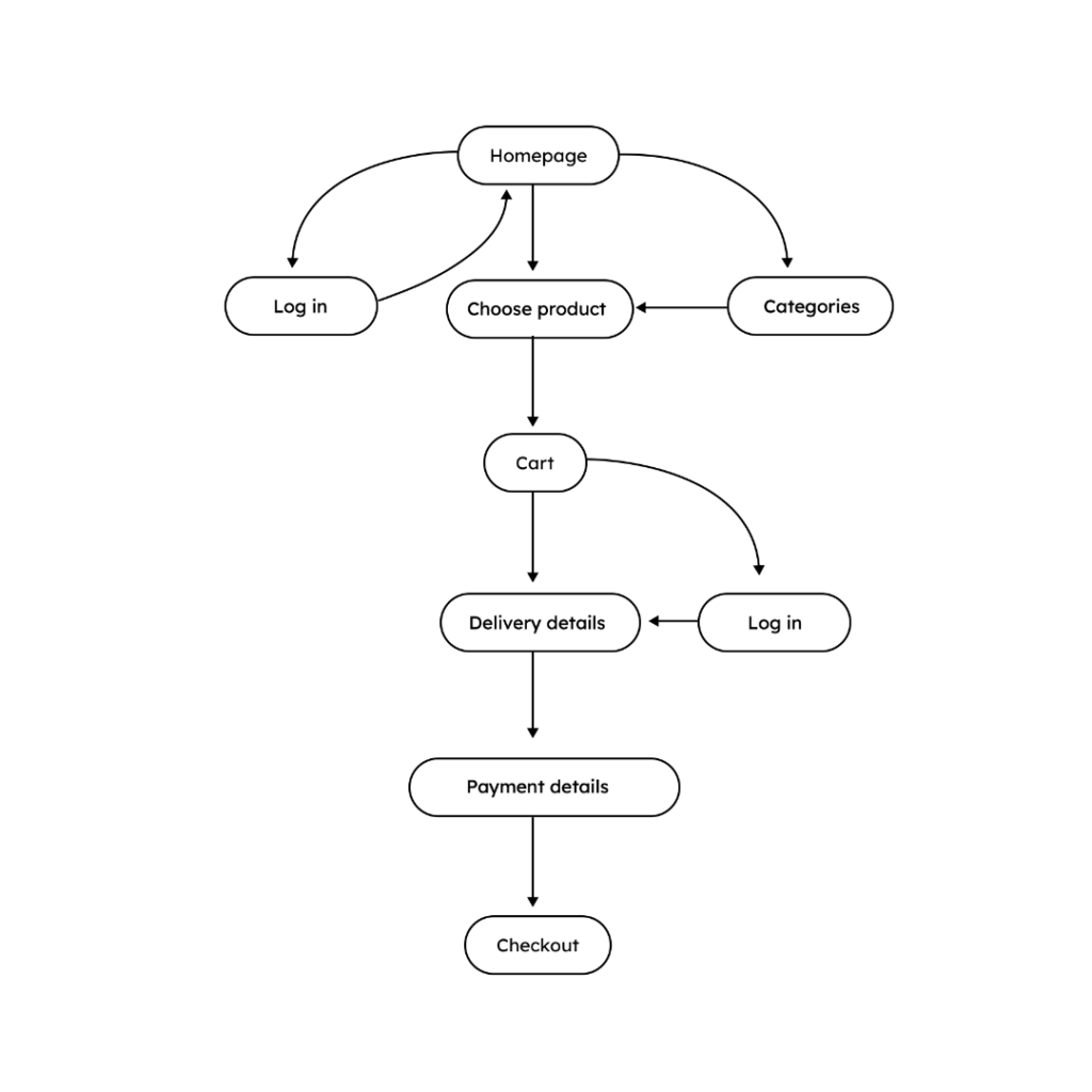
Creating a user flow diagram proved pivotal in refining the overall user experience, providing a clear roadmap for subsequent development. With this strong foundation in place, I proceeded to craft detailed wireframes, iteratively refining the final designs and optimizing element placements for maximum effectiveness.

Results and learnings
The culmination of these efforts resulted in a website design that is both simple and elegant, tailored specifically to meet the user flow needs of the target demographic. Through meticulous adjustments and refinements, the design achieved a seamless user experience, optimized to resonate with the intended audience.


