Ember instruments logotype
Ember instruments is a brand crafting handmade guitars and basses. Logotype spotlights the prominent “MB” initials, representing the skilled luthier behind each instrument. The handwritten, flowing script enhances the allure of these meticulously crafted pieces, drawing attention to the unique character of every creation.
Research
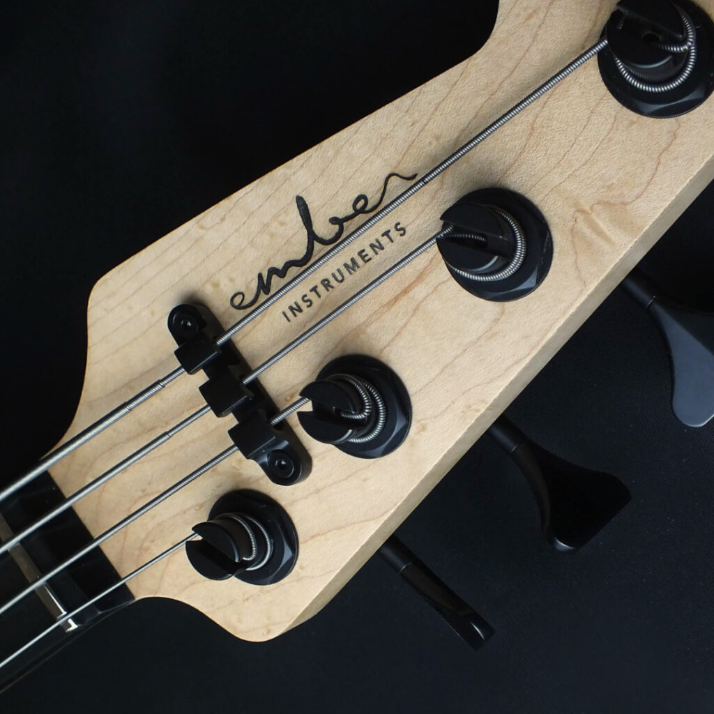
One of the primary considerations guiding the design process was the placement of the logo. Given that the Ember instrument logo would predominantly reside on the guitar headstock, its layout needed to be tailored accordingly. This insight prompted the incorporation of a gap in the middle to ensure the logo remains fully visible and unobstructed.
Ideation process
The insight into the manual guitar-making process inspired the concept of a logo design that exudes organic flow while projecting strength and solidity. The primary word, “Ember,” is elegantly scripted, with emphasis placed on the “MB” letters at its core. In contrast, the secondary word, “instruments,” is rendered in a minimalistic sans-serif font. This deliberate interplay between styles mirrors the nuanced craftsmanship inherent in guitar making—where meticulous attention to both form and function is paramount.

Results
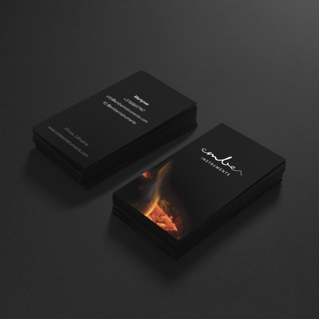
A minimalist and refined design, seamlessly adaptable for placement on both guitar headstocks and business cards.

